It all starts with a dot and line.
![]()
![]()
It all starts with a dot and line.


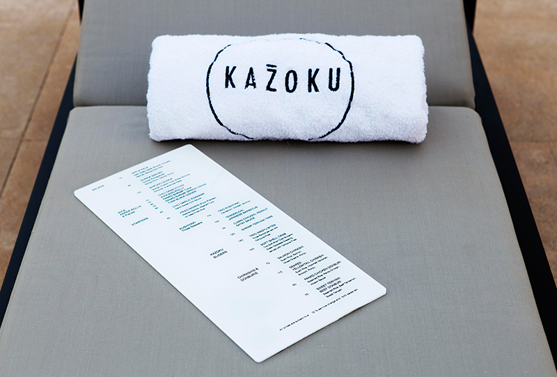
/kazoo:ko/
family in Japanese
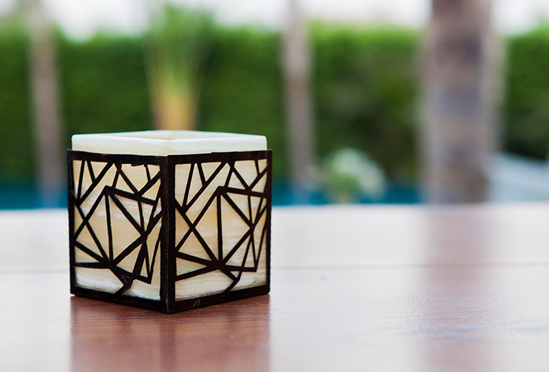
To emphasize the concept of family, the circle was chosen as the brand’s main visual element. Based on its philosophical interpretation, the shape represents unity, continuation and harmony. Aside from its strong visual grammar, the viewer will relate to a circle the most out of all shapes.
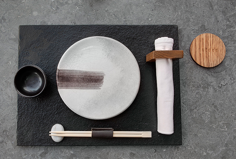
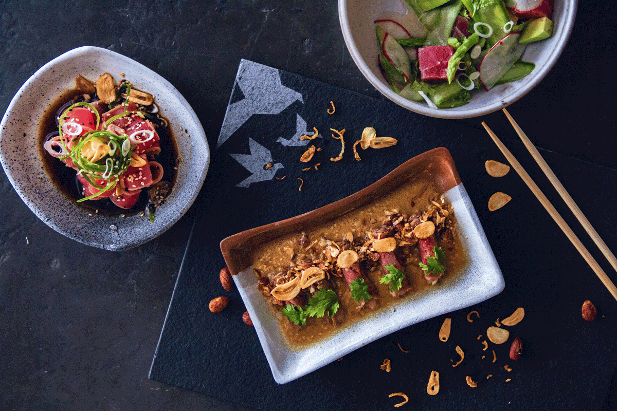
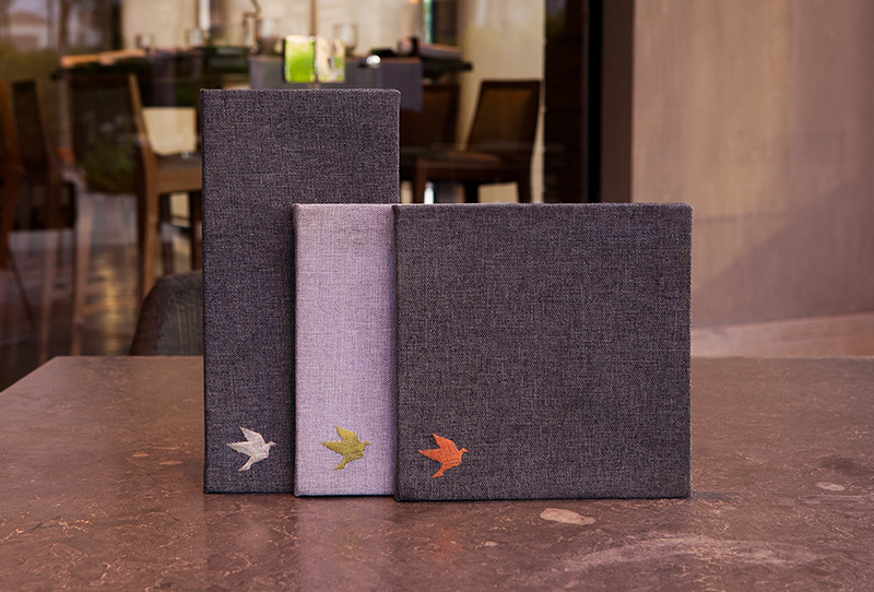
We included the origami art in the brand identity since it is part of the Japanese culture. The technique was integrated in the shape of birds creating a flock, depicting the concept of the family and how strong they become when staying together. Another side to it, is that it is a type of art in which we tied it down to Kazoku’s core value, which is to create culinary art. Hence the slogan “the art of dining”
May 30, 2017